
I've been exploring, finding and creating with a very interesting and resourceful free digital software called Infogram. This blog post will host some examples of what I've created and uploaded using Infogram, as well as revealing some insights on how this technology could impact the classroom, opportunities students may encounter and just how to customize and create within the easy to use infographic, interactive map, online report and chart maker; Infogram.

Infographics is a unique way to combine visual literacy with data analysis to portray a visual representation that leads the reader to a clear conclusion. They pack a punch in the classroom and often allow you to pack big ideas into small spaces, while this information is also presented in compelling, colorful and engaging ways. Infogram gives an intuitive and effective way to create these for free!
When creating a free account with Infogram, you need to select what kind of organization you belong to? and What is your role?

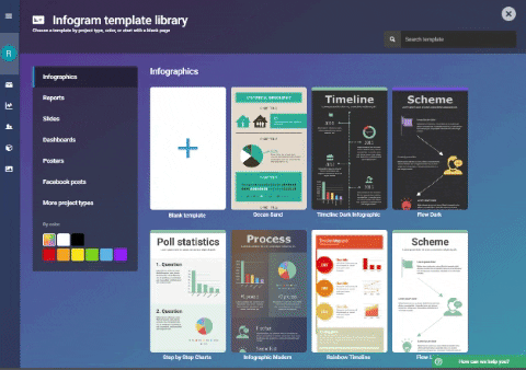
 |
| (Image Source: https://infogram.com/app/#/library) |
 |
| (Image Source: https://giphy.com/channel/rileysteffen) |
 |
| (Image Source: https://infogram.com/app/#settings/plans) |
 |
| (Image Source: https://infogram.com/app/#/templates) |
SCIENCE: Performing an Experiment.
Substitution Level: Input experimental data collected into an existing graph template.
Augmentation Level: Change and alter the information according to the average of all students data collected.
Modification Level: Compare statistical data found individually and averaged data found from all participants and present in a report.
Redefinition Level: Research statistical information and creates/presents a presentation using/sharing with peers or globally for feedback and questioning.
Learning about and using Infogram has increased my own capacities to use digital media technology and built upon the ways I display data. I hope you have enjoyed learning something new! and think about the potential learning styles you can now cater for with the use this software.
Thanks,
Riley.
Riley
ReplyDeleteWell done on an informative post. You have experimented well with Infogram as a data report format and implications for the classroom are clear. It would be a very efficient way to spot issues with mathematical concepts eg. you have 1 female figure to represent ⅓ , yet 3 male figures to indicate ⅔! Would have been great to see Australian data to add a connected context for your readers. Nonetheless a pleasing overview of possibilities.
Your examples of proposals for learning with selected digital tools demonstrate some alignment with each of the levels: substitution, augmentation, modification and redefinition of the SAMR model and Bloom’s Taxonomy. The example draws on your own teaching context in the Science area, but the reflection overall can, and should, be strengthened with acknowledged reference to illustrations of pedagogical models (eg TPACK) and relevant course/found materials/readings. You have mentioned SAMR but this should be referenced to model legal, safe and ethical practice in your own work. Also consider a more specific task e.g. "chemistry experiment to find..."; this will allow you to create identifiable learning experiences that ultimately use Infogram to redefine the task. You do need to work on this. See a clear example in the Topic 6 tutorial.
Great to see reference to school IT policies... this is very important and sadly, can be a limiter for some digital tools depending on context.